
Why layout needs visual tools
Flexbox, grid, and container queries position elements using rules you cannot always see in the numbers. A gap might come from justify-content, a margin, or an empty grid track. DevTools solves this by drawing the layout directly on the page, so you can see the structure instead of guessing.
Debugging Flexbox
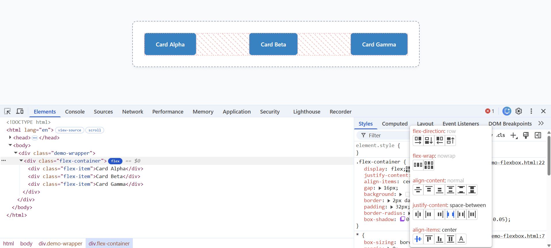
Flexbox is a one-dimensional layout system — it arranges items in a row or a column. When an element uses display: flex or display: inline-flex, DevTools shows a flex badge next to it in the Elements panel.
- Toggle the overlay: click the flex badge to draw a dotted outline over the container and its items, showing how space is distributed.
- Use the flexbox editor: in the Styles pane, click the icon next to display: flex to open an editor where every alignment property is a clickable icon — no need to remember align-items versus justify-content.
- Manage overlays: open the Layout pane and scroll to the Flexbox section to list every flex container and recolor each overlay.
Debugging CSS Grid
Grid is a two-dimensional layout system — it arranges items in rows and columns at once. Elements using display: grid or display: inline-grid show a grid badge. Click it to overlay the grid on the page, complete with line numbers.
Open the Layout pane and find the Grid section for finer control. There you can switch the overlay's labels between Show line numbers, Show line names, and Show track sizes, reveal area names, extend the grid lines to the viewport edge, and display several grids at once, each in its own color.
Subgrid
Subgrid lets a nested grid borrow the rows or columns of its parent, so child items line up perfectly with the outer grid. When an element uses subgrid, DevTools shows a subgrid badge. Click it to toggle an overlay that reveals the inherited tracks, so you can confirm the alignment is coming from the parent.
Container queries: responsive to the container, not the screen
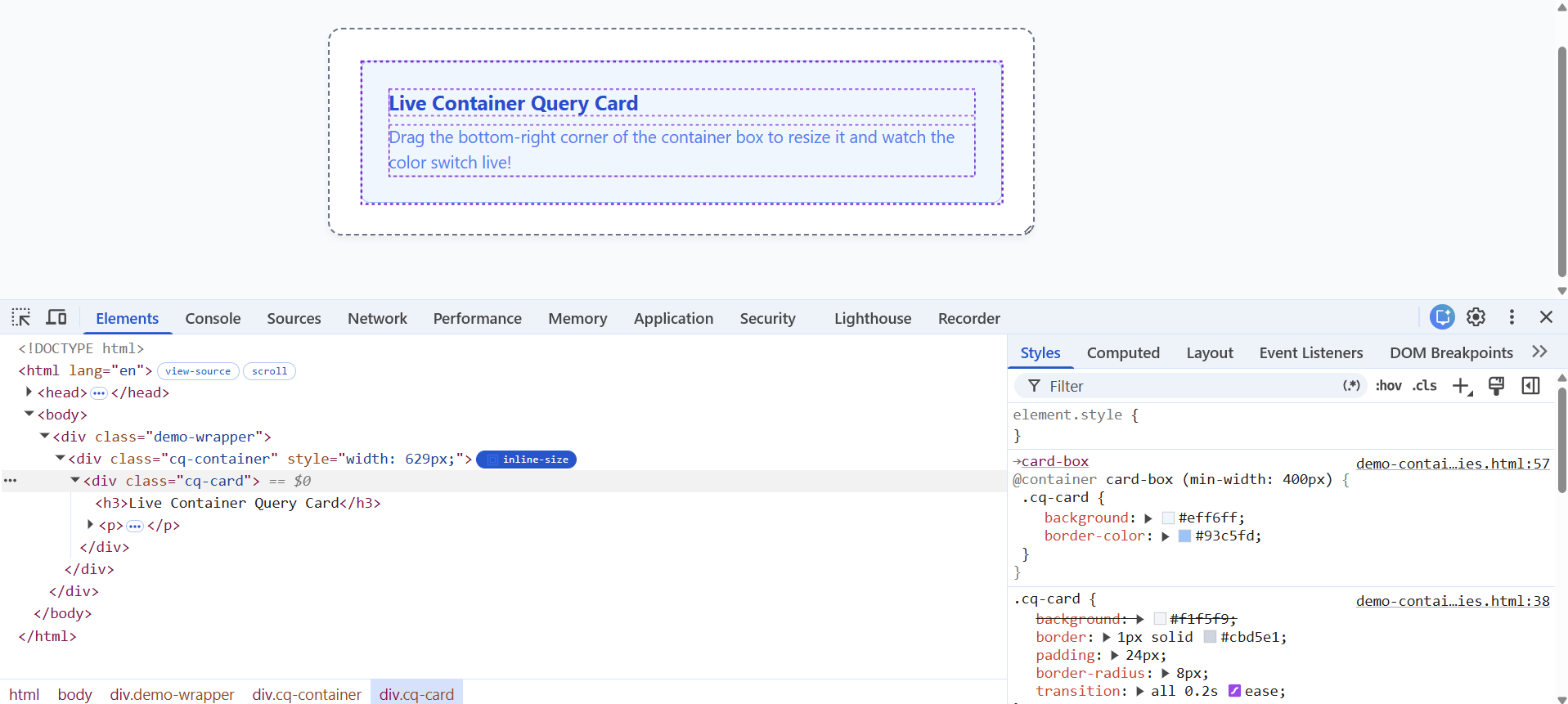
A container query lets an element change its style based on the size of its parent container rather than the size of the whole browser window. That makes a component — a card, a sidebar widget — truly reusable, because it adapts wherever you drop it.
DevTools shows a container badge next to a query container; click it for a dotted overlay of the container and its descendants. Select an element affected by a query and the Styles pane shows the @container rule, with a link up to the parent container so you can jump between them.
Bonus: the Animations panel
CSS animations are part of layout and feel, and they are just as hard to inspect while they play. Open the Animations panel from the Command Menu (Ctrl+Shift+P, type "Show Animations") or More Tools › Animations. It automatically captures animations into groups as they run.
- Slow it down: use the Animation speed buttons to play an animation at reduced speed.
- Scrub it: drag the red playhead along the timeline to move through the animation frame by frame.
- Inspect and replay: click an animation group to see its details, and press Replay to run it again.
Hands-on: debug a layout and tune a breakpoint
- 1Find a grid: on any grid-based page, inspect the container and click its grid badge to show the overlay.
- 2Label it: open the Layout pane and turn on Show track sizes and Show line names.
- 3Find a flex row: inspect a navigation bar or button row, click the flex badge, and open the flexbox editor to change the alignment with clicks.
- 4Container query: if the page uses one, edit the @container condition in the Styles pane and watch the component reflow. (No container query handy? Try Chrome's own docs pages, which use them.)
- 5Break & Fix: change one grid item's grid-column to an out-of-range value, watch it break in the overlay, then use the visible line numbers to correct it.
What's next
You can now see and fix layouts instead of guessing at them. So far everything has been visual. Next we open the Console — where you type live JavaScript, read errors, and, for the first time in this series, ask DevTools' built-in AI to explain what went wrong.
Frequently asked questions
- What is the difference between flexbox and grid?
- Flexbox is one-dimensional — it lays items out in a single row or column. Grid is two-dimensional — it positions items across rows and columns at once. DevTools shows a flex badge for one and a grid badge for the other.
- How do I turn on the grid overlay in Chrome DevTools?
- In the Elements panel, click the grid badge next to an element that uses display: grid. For more control — line numbers, track sizes, area names — open the Layout pane and use its Grid section.
- What is a container query, and how is it different from a media query?
- A media query responds to the size of the whole viewport. A container query responds to the size of an element's own container, so a component adapts wherever it is placed. DevTools marks containers with a container badge.
- Can I change a container query breakpoint without editing my source files?
- Yes. In recent Chrome you can edit an @container rule's condition directly in the Styles pane and see the result live. As with all live edits, copy it from the Changes drawer before reloading, because it is not saved to your files.
This article was produced with AI assistance for drafting and research. All facts have been verified and the final content has been reviewed and approved by a human editor.